Filed under: Typography
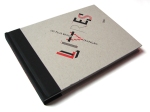
Yesterday we had the yearly type conference at the school where I’m employed. It was a great day! My fave speaker was Peter Biľak who unveiled a fabulous display type project called History. I was amazed. His initial plan was to make a display font with as much work put into it as a text font and it sure came out very interesting. He wanted the font itself to show the history of type. He started with the basic shape of the letters from the Trajan column and then built various different style of contrast, fills, serifs, swashed and so forth on top of it. The result is an intricate piece of work which can be either completely out there, or very classy. A lot of people are using it as a mix with great outcomes. Check out the AIGA poster and the French book shown bellow.
See more about History at Peter’s foundry Typotheque.
1 Comment so far
Leave a comment


[…] by Canadian design studio Working Format. It reminds me a little of Peter Bil’ak’s font History which I blogged last year but I like how the letter shapes are more […]
Pingback by Working Format « Inspiration Lab November 29, 2010 @ 9:55 am